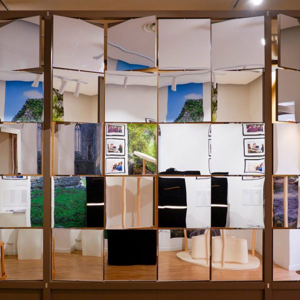
Dezeen School Shows: we’ve picked ten student design projects featured in Dezeen School Shows that are informed by the output of established creatives, writers and architects.
These undergraduate and postgraduate student design projects reference various other creative mediums, ranging from art and music to literature and film.
Through direct reference, these projects showcase and honour chosen practitioners and their work, whilst others are more subtle, showing reference through inspiration and informed design.
Projects in this roundup include a kindergarten inspired by the De Stijl movement, a bench made of oak inspired by the work of Naoto Fukasawa and the Danish concept of hygge, and a display case intended to preserve architectural ruins informed by the work of Carlo Scarpa.
The selection of projects comes from students on courses including fashion design, technology design, graphic design and architecture enrolled at international institutions including YACademy, Virginia Commonwealth University of the Arts and Toronto Metropolitan University.
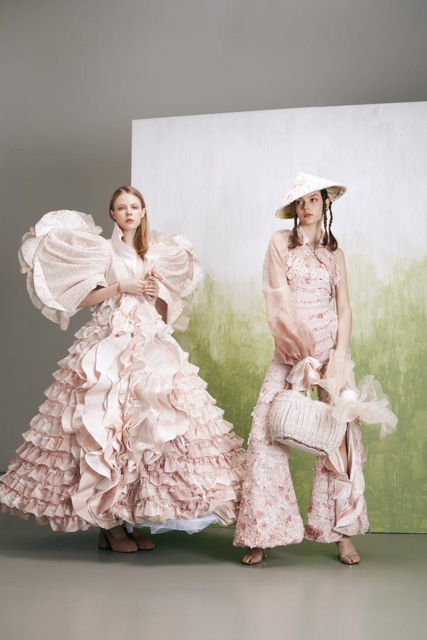
Maharlika by John Marcus Banday Mase
Fashion design student John Marcus Banday Mase’s fashion collection Maharlika is inspired by the song Feel Special by Twice – the song’s influence is materialised in Mase’s concept by identifying three elements that make them feel special: Filipino culture, womanhood and painting.
These are represented through the designer’s aesthetic decisions for the collection, which sees a combination of traditional Filipino garments alongside pink, floral motifs.
“The mission of the Maharlika collection is to empower women by making them feel like the blooming flowers they are and to fight for women to dismantle oppressive systems on a global scale,” said Mase.
“Through this collection, [I hope] to create a fashion statement that not only celebrates Filipino culture and womanhood but also inspires a sense of pride and belonging in the wearers.”
Student: John Marcus Banday Mase
School: Hong Kong Design Institute
Course: Higher Diploma in Fashion Design
View the full school show ›
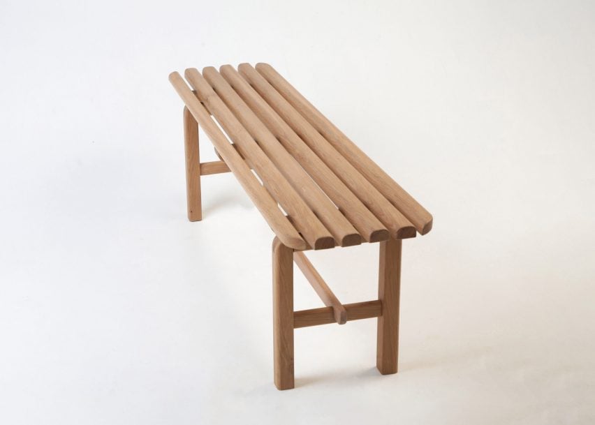
Hankei—Radius by Phoebe Li
Hankei–Radius is a slatted bench designed by product and furniture design student Phoebe Li, inspired by the work of Japanese designer Naoto Fukasawa.
The bench is also informed by the Danish concept of hygge, which emphasises the qualities of cosiness and comfort.
“Crafted from oak, its gentle curves aim for a harmonious balance of simplicity and elegance,” explained Li.
“This bench encourages you to unwind and embrace the comforting ambience of hygge.”
Student: Phoebe Li
School: Northumbria University
Course: BA Hons Furniture and Product Design
View the full school show ›
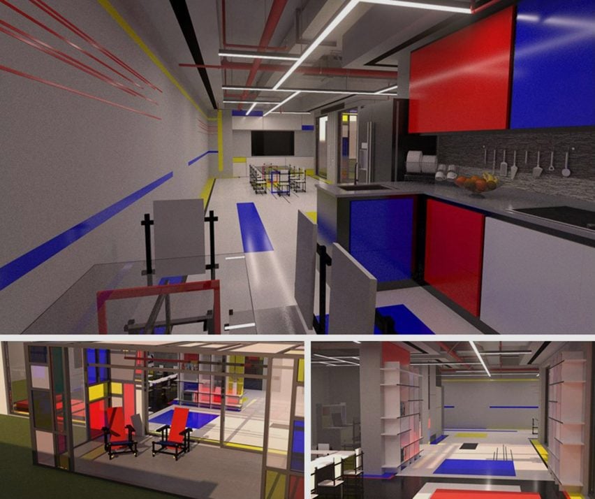
A Kindergartner, Not a Usual One by Elie Boutros
Interior design student Elie Boutros directly referenced the De Stijl art movement when designing this kindergarten design scheme.
Aiming to lift two-dimensional art into a three-dimensional space, the design incorporates the style’s iconic combination of red, blue and yellow colours through a range of applications.
“The design intricately weaves De Stijl’s distinctive geometric abstraction and primary colours into the fabric of the kindergarten’s environment, underscoring the complexity of interior design as a tool for cognitive and creative stimulation,” said Boutros.
Student: Elie Boutros
School: Ajman University
Course: Interior Design Graduation Project I and II
View the full school show ›

2 + 2 by Katerina Hionis
2 + 2 by communication design student Katerina Hionis is an interactive website referencing George Orwell’s novel 1984.
Through a contemporary lens, the project incorporates quotes from the novel to comment on the manipulation of personal data in modern society, conveyed through motion typography.
“Motion typography illustrates data falsification in real time, reinforcing how misinformation and propaganda overpower truth,” Hionis explained.
“To access the privacy section, the user’s ID number is identified. The website opens the intrusive data profile of a 23-year-old, comparing Nineteen Eighty-Four’s telescreens to data collection today.”
Student: Katerina Hionis
School: Swinburne University of Technology
Course: Communication Design
View the full school show ›

Assemblage Artist’s Studio by Michelle Ng
Michelle Ng, an interior design student, presents a three-dimensional rendering of sculptor Louise Nevelson’s studio.
The studio lends itself to the artist’s practice through an informed design that showcases her art whilst incorporating natural lighting and minimalist styles.
It also prioritises necessities for a functional workspace, including a large work table and storage space for materials and tools.
“Small details were included such as personal touches that reflect Nevelson’s love for cats and smoking,” explained Ng. “By reimagining her studio in this way, we take a closer glimpse into her life as an artist”.
Student: Michelle Ng
School: Toronto Metropolitan University
Course: IRN 601, Bachelor of Interior Design
View the full school show ›
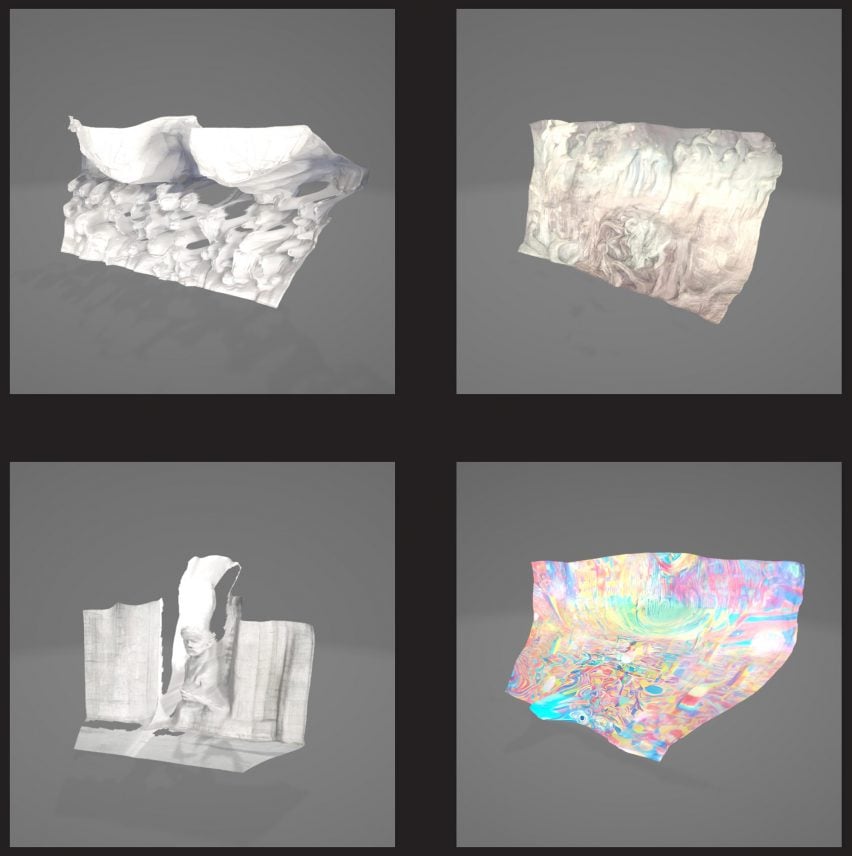
The Theatre Machine by Saw Man Lin
The Theatre Machine by architecture student Saw Man Lin references Shakespeare’s Hamlet, incorporating its renowned ‘to be or not to be’ soliloquy.
Adjacent to an actor’s performance, the project utilises generative AI to serve as a co-narrator and is an audio-visual telling of the soliloquy, interrogating the physical space between a performer and their stage.
“It reevaluates the storytelling-actor-space relationship dynamic,” explained Lin.
“This orchestration of the digital space yields a performance that reveals the relationship between the actor and the space.”
Student: Saw Man Lin
School: Singapore University of Technology and Design
Course: Master of Architecture – Architecture and Sustainable Design Pillar
View the full school show ›
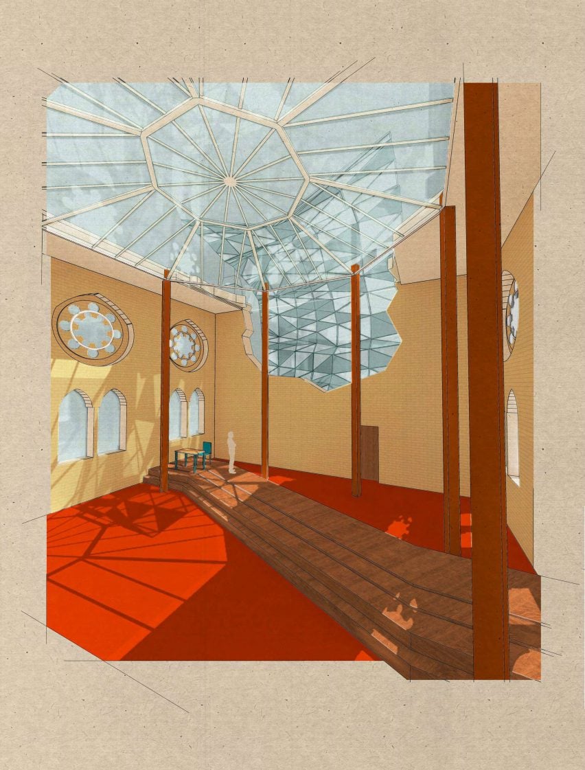
House For Her by Hannah Puttick
House For Her by interior design student Hannah Puttick responds to the film Her by Spike Jonze.
The project takes inspiration from the film’s two main characters to inform its design, integrating patterns of natural light to represent the relationship between them.
“I analysed the main characters – Samantha and Theodore’s – relationship, which was based on love but defined by a constant power struggle, which led me to create a futuristic and parasitic element in the design of House For Her,” said Puttick.
“In this design, Samantha is represented by the sun, creating a glare on ‘Theodore’s computer’ and forcing him to constantly move to avoid the light.”
Student: Hannah Puttick
School: University of Brighton
Course: BA (Hons) Interior Architecture
View the full school show ›
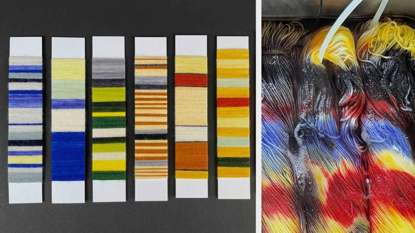
Road to Colour by Simone Kuhn
Textile design student Simone Kuhn produced a yarn collection in response to written works and photographs by Swiss writer Annemarie Schwarzenbach.
Kuhn investigated the potential for literature to inspire a colour, utilising selected writings and photographs by Schwarzenbach to produce a narrative through dyed yarn.
“Hand-dyed multi-colour and single-coloured yarns complement each other in small groups, thus forming chapters in this story,” Kuhn explained.
“The colours are used in a collection of high-quality hand-knitted yarns.”
Student: Simone Kuhn
School: Lucerne University of Applied Sciences and Arts
Course: BA Textile Design
View the full school show ›
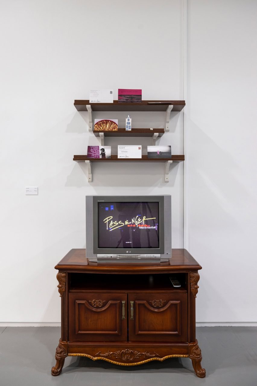
Cultural Misfits by Izaa Alyssa
Graphic design student Izaa Alyssa’s installation Cultural Misfits incorporates poetry and illustration to comment on cross-cultural experiences.
Multiple disciplines feature in the project, including Invisible Lines by Joud Ghaliyani (a Jordanian-Palestinian poet based in Qatar), Passenger by Nour Khairi (a Sudanese poet residing in England) and the work of illustrator Shima Aeinehdar.
The project aims to convey “feelings of rootlessness and restlessness”, which Alyssa explained are associated with establishing an identity amongst cross-cultural experiences.
“Together, these artistic expressions evoke a multi-dimensional experience, inviting profound contemplation of the intricate nuances of multiculturalism and the deep sense of belonging that arises from navigating multiple worlds.”
Student: Izaa Alyssa
School: Virginia Commonwealth University School of the Arts Qatar
Course: BFA Graphic Design
View the full school show ›
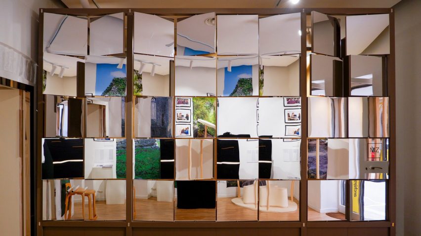
Carlo Scarpa re-make by Eleonora Di Girolamo, Isgandar Hajiyev, Ruth-Adalgiza Iacob and Anqi Pan
Architecture students Eleonora Di Girolamo, Isgandar Hajiyev, Ruth-Adalgiza Iacob and Anqi Pan’s project, titled Carlo Scarpa re-make, references the work of designer Carlo Scarpa in the form of a display case.
It is intended to be installed in Athassel Priory, Ireland, in order to preserve the site’s history.
The piece combines ancient stone from the ruins with modern elements of black burnt wood and gold inlays to encourage continued use of the priory.
“The result is a magnificent display case, inspired by the work of Carlo Scarpa, which can become an ingenious display product aimed at preserving precious items and telling the story of the archaeological site,” the students said.
Students: Eleonora Di Girolamo, Isgandar Hajiyev, Ruth-Adalgiza Iacob and Anqi Pan
School: YACademy
Course: Architecture for Heritage, 2022 Edition
View the full school show ›
Partnership content
These projects are presented in school shows from institutions that partner with Dezeen. Find out more about Dezeen partnership content here.

